Using InDesign was very new but as I slowly put all the projects and information, I really liked the way it all came together. I think the grids were really helpful for organizing the images. It did take a minute to put the divisions individually but it definitely facilitated the process. It was also very convenient to remove them and see how the page would turn out to look like. It was very cool to put together everything I made this semester.
Wow, I don’t think I’ve ever spent so much time on one assignment. I would literally compare the process of doing this animation when you go to the gym for the first time after a year and you’re really out of shape to the point that its painful. My brain would give out from doing the same process over and over, it got really tiring. I am proud of the result because I’ve never done anything like this and I genuinely spent so much time on it. I would love to put the sound on it because it makes the video so much better. I respect anyone who does this for a living.
A page on Instagram tampa.babes asked for a logo design, and I thought I should give it a shot since it’s good practice. Out of the 12 logos submitted mine won! They added some color for their account but I thought it would be cool to post on my blog.
Using the same picture I did a depiction of heaven and hell. I absolutely love the way they both turned out. The filters really help the each image stand out in its own way. I love how you can see the essential parts of each image to make tho whole composition stand out.
I really loved the way each of the Gifs came out. I played with the dither as well as the amount of colors. Each of them are so different to the original and have such unique looks.
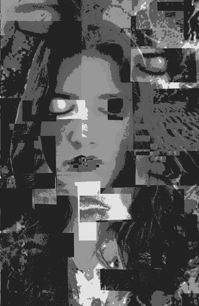
Through this Photoshop project I was able to portray the difficulty I have with imagining peoples perception of me. That is something I struggle with very often, I am constantly thinking about the way people view me and whether its positive or negative. I used 5 main filters to create a type of dissonance. They were; darker color, vivid light, difference, subtract, and lighten. This was by far the most fun project, experimenting with the filters and watch it all come together was very satisfying. I also played a lot with he transparency to create what looks like, different levels.
This project was also done using Photoshop. It was super fun and it was a little easier to do because it was related to the Somewhere project. I really liked the way it turned out, I tried to focus on minor details so it would look as real as
possible.